The Data Mirage: Why Pretty Charts Don’t Mean Smart Decisions
Walk into any modern boardroom today, and you’ll find an almost religious devotion to dashboards. There are colourful bar graphs, slick pie charts, a forest of trend lines, and scatter plots.
It feels empowering to glance at a screen and say, “Ah! I know what’s happening.”
But here’s the uncomfortable truth:
Most of those pretty charts are nothing but digital comfort blankets.
They soothe us. They make us feel “in control.” Yet, they often hide the real problems beneath their glossy veneer.
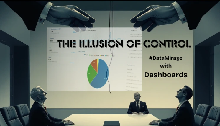
The Illusion of Control
We humans are wired to seek patterns. Show us a sudden upward spike, and we’ll immediately create a story: “Sales must be improving because of last month’s campaign.”
A downward trend? “Blame it on seasonality or the economy.”
But these stories are often shallow guesses, built on surface-level metrics. Dashboards rarely tell us why something is happening.
They don’t reveal causal relationships, underlying assumptions, or hidden frictions.
Worse? They give us a dangerous sense of finality.
We think the data on a dashboard is the destination, but in reality, it’s only the starting point. You can stare at a thousand charts and still make the wrong move.
Here’s a provocative question: “When was the last time a chart alone told you exactly what move to make next?”
It’s easy to become a passive observer. You watch. You wait. You tweak visuals. You ask your analyst for “one more slice” of the data. Meanwhile, the window of opportunity closes.
The board feels good, though; at least you’re “being data-driven,” right?
Let’s dispel the myth that data-driven work is not about admiring colours and patterns. It’s about transforming insights into bold, timely actions.
The Tyranny of Vanity Metrics
We all have those beautiful metrics that look impressive but mean little.
“Monthly active users.” “Page views.” “Impressions.”
What if we told you that your prettiest metrics might be the biggest culprits holding you back?
These numbers are easy to showcase in meetings, earning applause and nods of approval. But they rarely translate into better strategy, higher revenue, or market breakthroughs.
Here’s a brutal reality:
Data without context is noise. Dashboards without action are dead weight.
Because dashboards promise simplicity. They turn complex, messy business dynamics into neat, digestible shapes.
They give us a dopamine rush — that instant gratification of “knowing.”
But the deeper reason is more psychological: We’d rather feel right than be right.
Admitting that your beautiful dashboard isn’t enough takes courage. It means embracing uncertainty. It means having tough conversations about blind spots, hidden dependencies, and messy realities.
The Real Value of Data: Provocation, Not Decoration
Instead of asking, “What is this dashboard telling me?” ask, “What decisions can I make right now because of this data?”
Data’s true value isn’t in decoration, it’s in provocation. It should challenge, expose weaknesses, and force you to act differently.
Imagine your dashboard not as a polished museum exhibit but as a sparring partner in the ring. It should challenge your assumptions, test your resilience, and push you to make sharper moves.
Being stuck in “watch mode” is like driving a sports car but only ever sitting in the garage admiring it.
You need to shift into “move mode.” Where each data point is a lever. Where each insight triggers a what-if scenario. Where business users — not just analysts — own the story and take the wheel.
The Future Belongs to Decision-First Thinkers
We’re entering an era when the slow, committee-driven, slide-heavy approach to analytics will no longer work. Markets shift too fast, and opportunities vanish overnight.
What if you could stimulate business scenarios in real time? You can call it Real-Time Business Analytics.
What if you could test revenue paths like a chess grandmaster plays out possible moves in their head? What if you could stop living in the past and start shaping the future?
This isn’t some far-off dream. It’s already becoming the new competitive edge.
Look at the leadership meetings. How much time is spent admiring charts versus debating scenarios and deciding actions?
Ask yourself:
- How often do you pivot strategy mid-quarter based on fresh signals?
- When did you last simulate a what-if before committing to a budget?
- Do you feel empowered to act, or stuck interpreting graphs?
The Mirage Ends Here
The Mirage, that comforting glow of colours and KPIs, is tempting. But you must break free if you want to lead, not just observe.
Imagine a new real-time business analytics experience, not a static wall of charts but a living, breathing decision engine.
Something that doesn’t just show what happened but helps you simulate what could happen.
Something that empowers you to stop being a watcher and start being a mover. Something that transforms your data from a dusty museum artifact into a sharp sword for market battles.
In some corners of the business world, a quiet revolution is underway. A few leaders have stopped worshipping dashboards. They’ve stopped obsessing over pixel-perfect charts and focused on analytics for business decisions instead, which propel real-time business decisions.
Instead, they’ve started building living systems that think alongside them. Systems that let them play out scenarios, test assumptions, and make confident moves faster than their competitors can open another slide deck.
Next time you feel comforted by your beautiful dashboard, remember: Pretty charts don’t mean smart decisions.
Decisions are forged in discomfort, iteration, and motion, not passive admiration.
The future belongs to leaders who refuse just to watch history unfold and instead shape it in real-time business analytics.
What we truly need aren’t more dashboards to admire, but decision engines that empower us to move, simulate, and act with confidence.
You think your dashboards tell the whole story? What if they’re only showing you the safest surface?
We’re about to unveil a new era beyond the dashboard.